

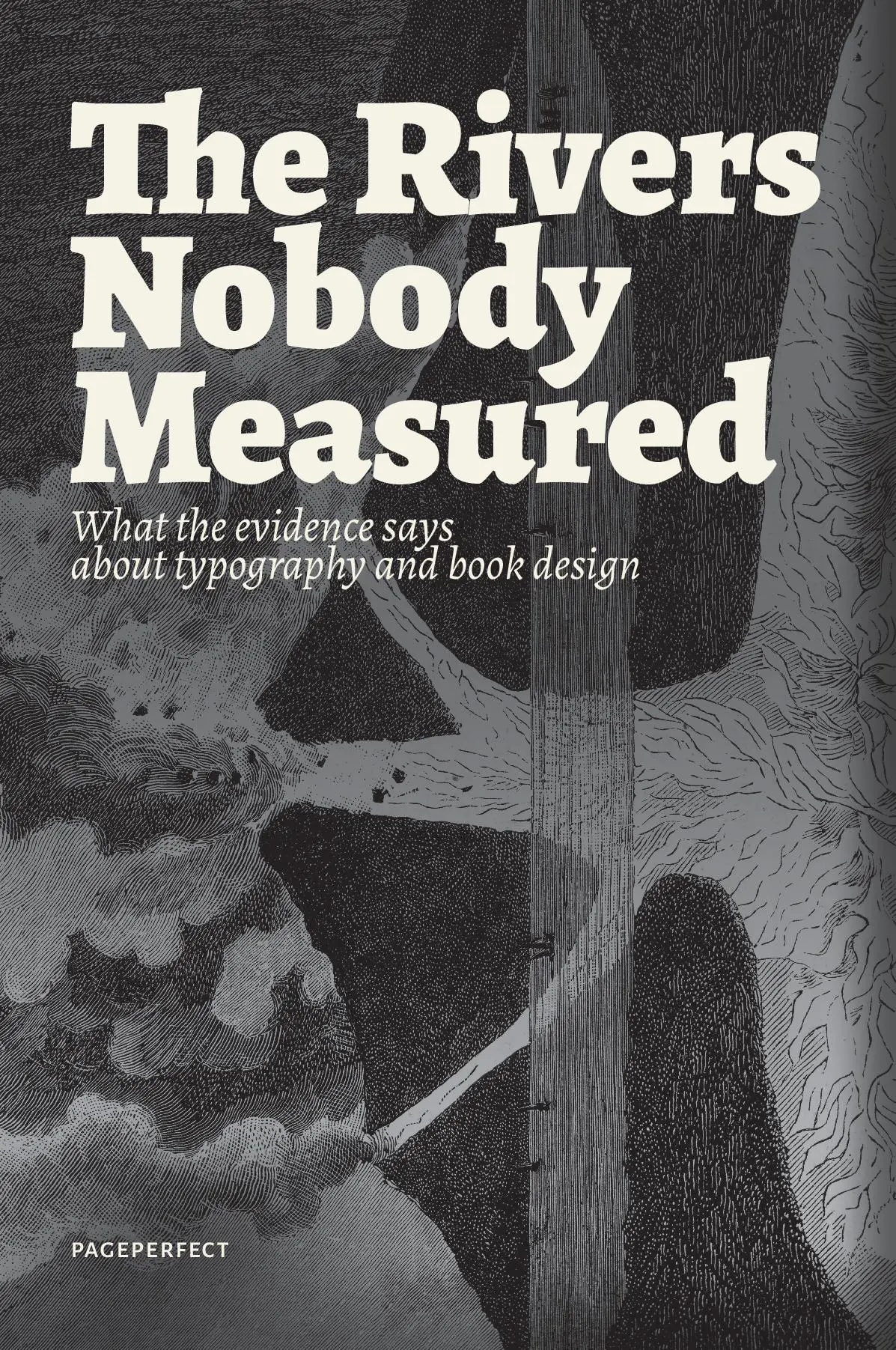
Description
White channels running down a justified page are said to strain the eye. We could not find a study that measured it. Serif type is said to read better on paper, and a line of text to have a right number of characters. Some of these rules hold. Others hold only under conditions the rule leaves out, and a few rest on nothing at all.
These twenty-three essays check the rules of typography and book design against their sources: the reading studies, the printers’ own specifications, the historians, and measurements made for this book. Every claim a reader could dispute carries a note that names its sources and says how strong the evidence is, from A for direct evidence to E where the sentence is the book’s own argument.
The book practises what it describes. Its text block is the ninth-division block one essay traces, and its 57 figures were drawn by the program that set the text.





Reviews
There are no reviews yet.